Overview
Every politician has a line about jobs. I wanted the number behind the line: not the headline rate, but the shape of who is working, in what, full-time or part, and how that has shifted.
So I built the whole stack an analyst actually uses. Python pulls the ABS Labour Force series straight off the API, dbt models it into a star schema with a test suite attached, and Power BI and Excel read the curated mart on top. It runs end to end on one command, on a laptop, for nothing.
Then I used it. The section below is the part I care about most: a question, an answer, and the moment the obvious answer turned out to be wrong.
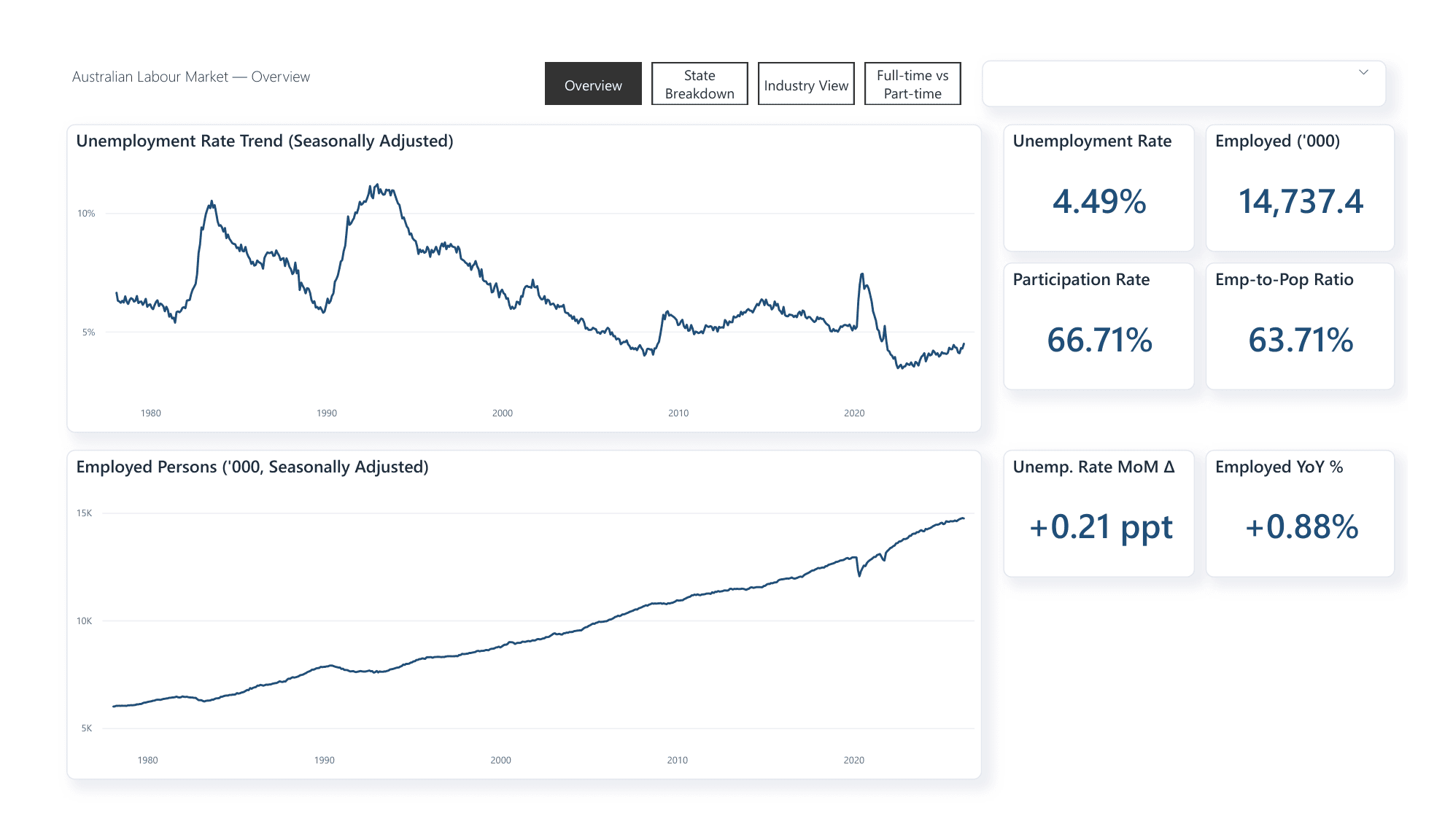
4.43%
National unemployment rate, June 2026, near historic lows.
14.8M
Employed persons, a record 14,823k, up 1.73% year on year.
124
Automated data-quality tests, run on every push.
The finding
The gender full-time gap is closing. For most of this century it was closing for the wrong reason.
Of employed Australians in June 2026, 79.7% of men work full-time against 56.6% of women. That is a 23.1 percentage point gap, and it is narrowing faster than at any point since the series began in 1978: about 0.7 points per decade in the 1990s, and roughly 6.6 points per decade since 2017.
A gap can close two ways. The lower line rises, or the upper line falls. Which one is happening changes what the number means completely, so I checked.
The gap between male and female full-time rates
percentage points, annual average, band 20 to 34The gap widened through the 1980s, peaked at 32.1 points in 1992, and has fallen since. The steepest decline in the whole series is the most recent stretch.
Measured from 2000 to today, the arithmetic looks damning. Women’s full-time share is unchanged, down 0.1 of a point, while the male share fell 7.5. Read literally, that says 99% of the convergence came from men losing full-time work rather than women gaining it. It is tidy, quotable, and wrong.
It is wrong because women’s rate did not sit still. It fell for 39 years, bottomed in January 2017, and has risen since. Averaged across the turn, the two movements cancel and the turn disappears.
Who closed the gap, split at the 2017 turning point
% of the gap change coming from each sideBefore 2017 both rates were falling and the gap barely moved, closing 1.5 points in seventeen years. Since 2017 it has closed 6.0 points, and most of that is women moving into full-time work. It is the first era in the entire series where that is true.
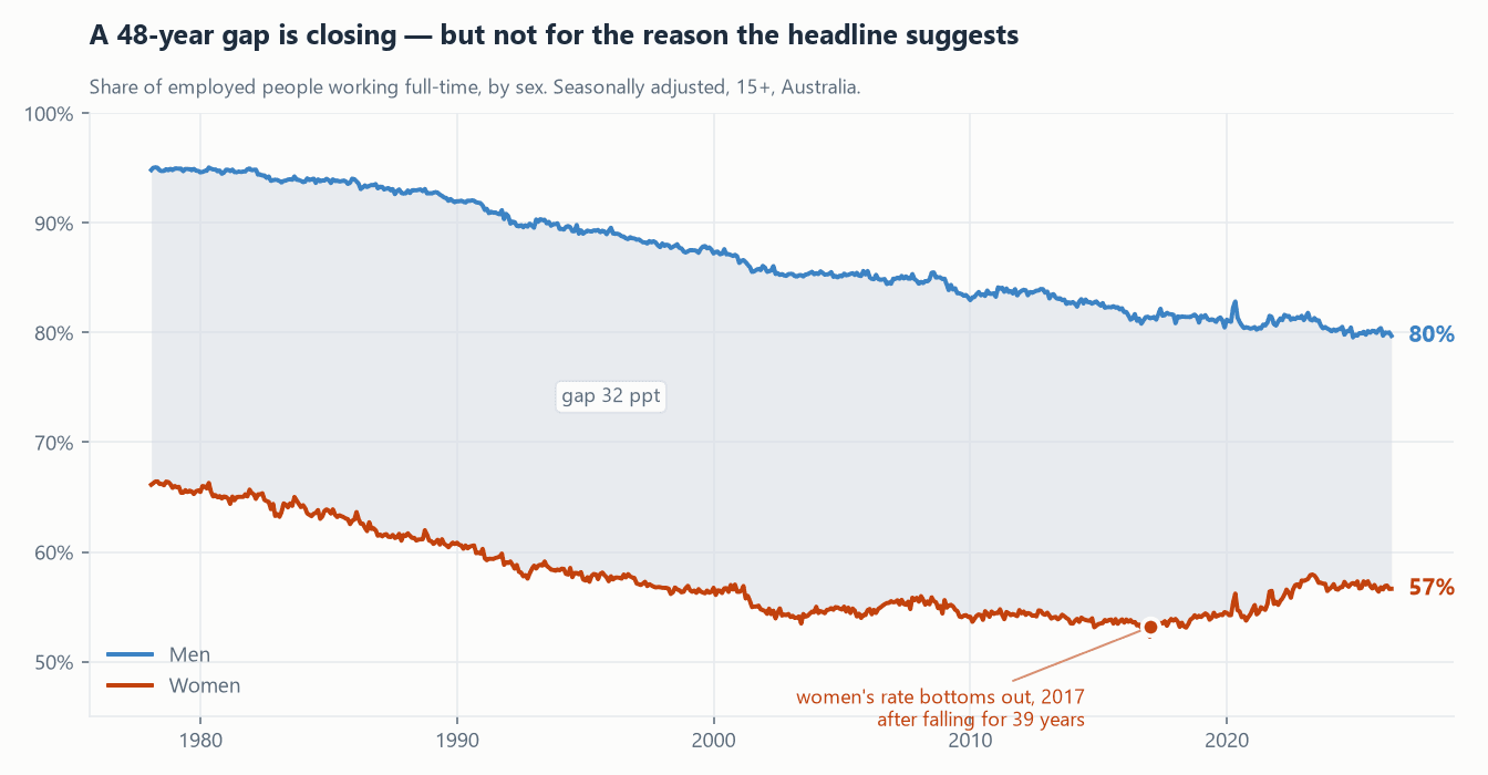
So the honest answer to "is the gap closing?" is: yes, four times faster than in the 2000s, and only in the last nine years has it been closing for the reason most people assume.
What was pulling the men’s line down was not unemployment. It was part-time work.
Part-time work among employed men went from 5.2% in 1978 to 20.3% today, roughly one in twenty to one in five. That is the part of the convergence that is good news for nobody. A gap that narrows because the higher group is losing full-time work is a different phenomenon from one that narrows because the lower group is gaining it, and until 2017 Australia was mostly doing the first.
One more correction, because a flat rate is not a flat trend.
"Women’s full-time share was unchanged from 2000 to 2017" invites a second wrong conclusion, that women made no full-time gains. They made enormous ones. Women in full-time work went from 1.40 million in 1978 to 4.03 million today, up 188%, against 67% for men. Their share of all full-time jobs rose from 27.6% to 39.6%. The rate stayed flat because female employment grew fast enough that full-time and part-time grew together.
Both statements are true, and reporting either one alone misleads. It is the clearest argument in the dataset for never shipping a rate without its level.
- 01Never quote the gap on its own. It moves for two opposite reasons and cannot tell you which.
- 02The post-2017 trend is the genuinely encouraging one, and it is recent enough to be fragile. It deserves its own monitoring, not a 25-year average that hides it.
- 03At the pace of the last fifteen years, 4.6 points per decade, parity arrives around 2076. "Closing fast" and "closing within a working lifetime" are not the same claim.
The build
The pipeline is deliberately boring, which is the point. Python does two things only: call the ABS API and land the response exactly as it arrived. Everything after that is a dbt model, so every transformation is documented, version-controlled and covered by a test rather than buried in a script nobody reads.
The models resolve into a star schema. One fact table holds every ABS observation, and the attributes that describe it, what is measured, for whom, where, on what basis, live in dimensions beside it. The previous version loaded four wide tables that were four different flattenings of the same rows, which meant anything you wanted to slice by had to already be a column in the right one.
- 01IngestABS Data API, Python, live pull, no key
- 02LandSQL Server, raw schema, response kept verbatim
- 03Modeldbt, staging to star to mart, 124 tests
- 04VisualisePower BI, Excel, generated as code, DAX, Power Query
The Power BI report is generated by a Python script rather than hand-built in Desktop. One build_report.py writes the data model, every visual, the 15 DAX measures and a custom colour theme as text files, so the entire dashboard is diff-able and reviewable like code. If it ever corrupts I regenerate it instead of fighting a binary .pbix. The Excel workbook is generated the same way, and refreshes off the mart in one click.
Two workflows run in CI. Every push builds the whole warehouse from a committed fixture and runs all 124 tests, deliberately without calling the ABS, because a pull request should fail when someone breaks a model and not when a government website has an outage. A second job runs weekly against the live API, where a failure is the notification that something upstream changed.
The earlier version of this project ran on Azure SQL. I tore it down on purpose: a portfolio project should not carry a monthly bill, and the cost of that decision was that the repo described a pipeline instead of being one. Rebuilding it on SQL Server in Docker means anyone can clone it and get the same marts, for nothing. The T-SQL dialect is the same one Azure SQL and Fabric speak, so pointing it back at a cloud warehouse is a config change rather than a rewrite.
Where the data pushes back
Two things in this dataset are wrong in ways that look completely normal on a chart.
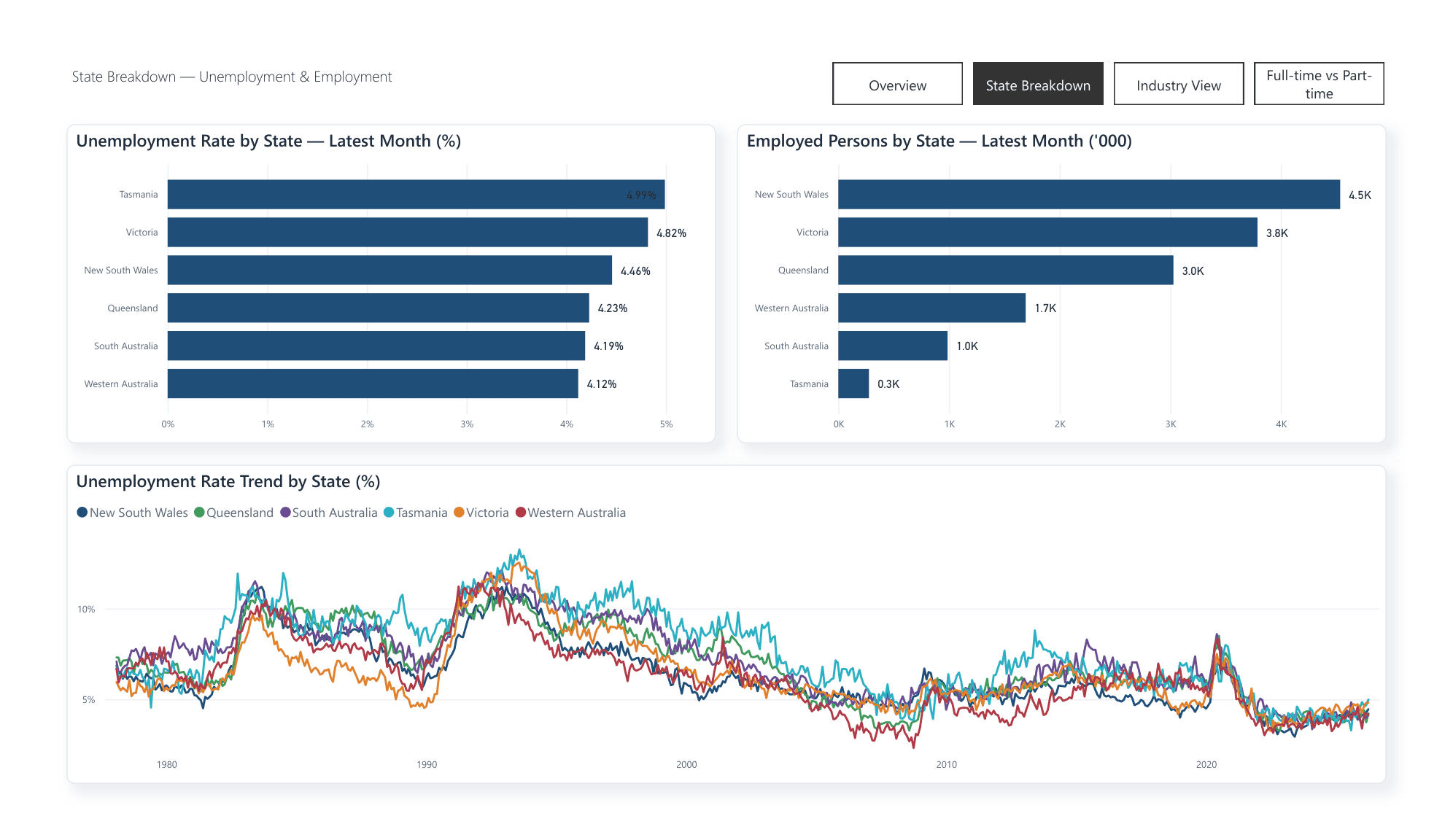
The ABS does not publish a seasonally adjusted series for the Northern Territory or the ACT, because those survey samples are too small to adjust. Ask the API for all eight jurisdictions on that basis and it returns six, with a 200 OK and no warning: the response is the intersection of what you asked for and what exists. The first version of this dashboard shipped a state page missing two territories, and it looked entirely normal.
Unemployment rate by state and territory, June 2026
%, Trend series, all eight jurisdictionsI expected wide regional gaps. Instead the spread across the whole country is under a single percentage point.
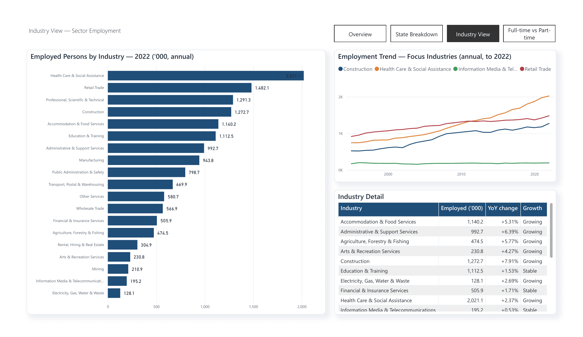
The second is vintage. Health Care and Social Assistance is the country’s largest employer by headcount, ahead of Retail Trade, but the industry breakdown comes from the annual ABS Labour Account, which lags badly and ends at 2022 while everything else is current to June 2026.
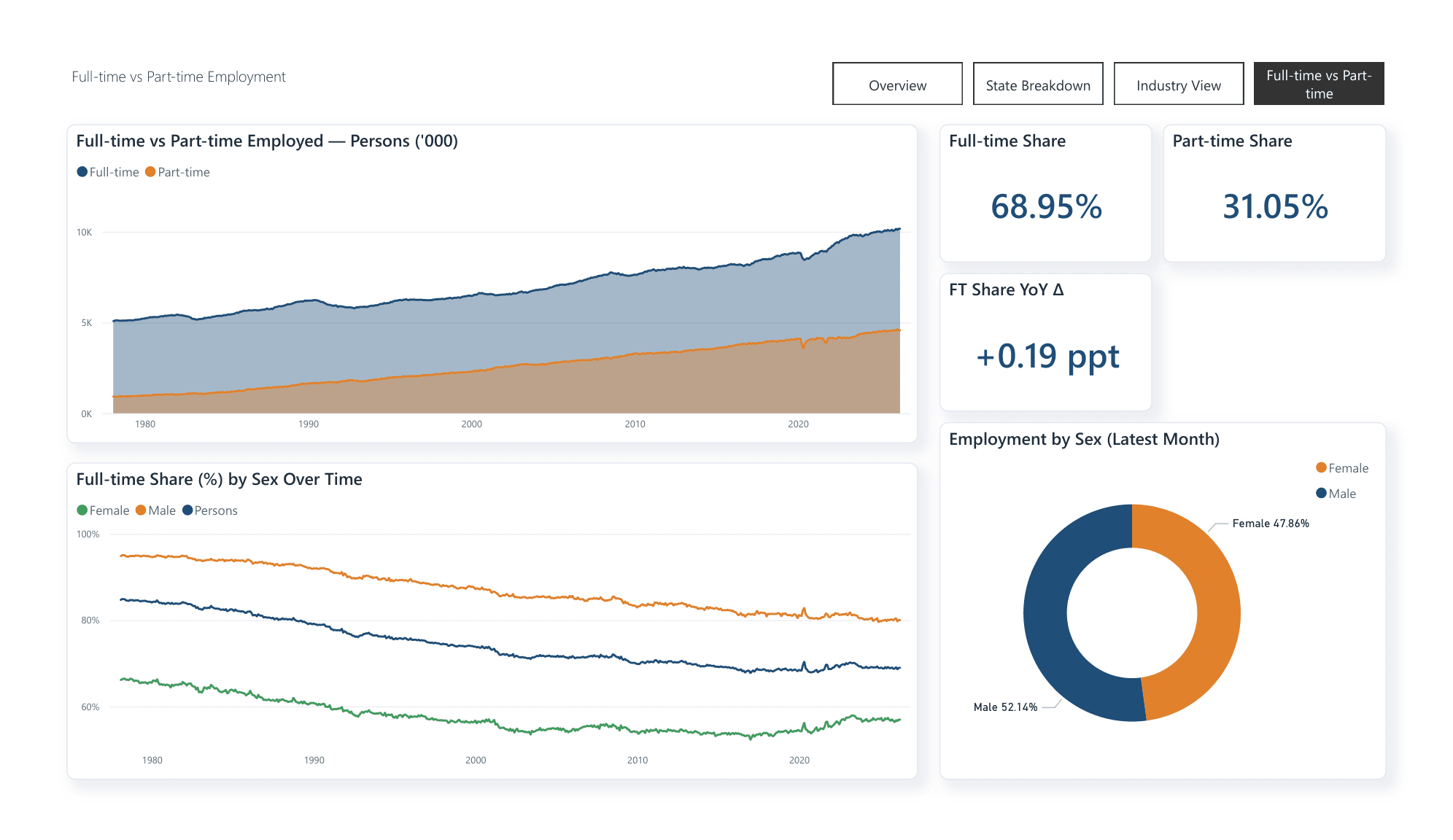
The headline rate hides the composition. Who works full-time, and why that is changing, is the part that actually moved.
What is next
- 01Separate voluntary from involuntary part-time work using the ABS underemployment series. Without it, "part-time" conflates a preference with a constraint, and that distinction decides whether the male full-time decline is a problem or a choice. It is the honest next question and the one I would ask first.
- 02Test whether the 2017 turning point is compositional. The current extract is national totals only, with no age or industry split on the full-time series, so I cannot yet rule out that it reflects a change in who is employed rather than a change in the work on offer.
- 03Replace the stale annual industry source with a quarterly Labour Force Detailed employed-by-industry series, so every page is current to the same month.